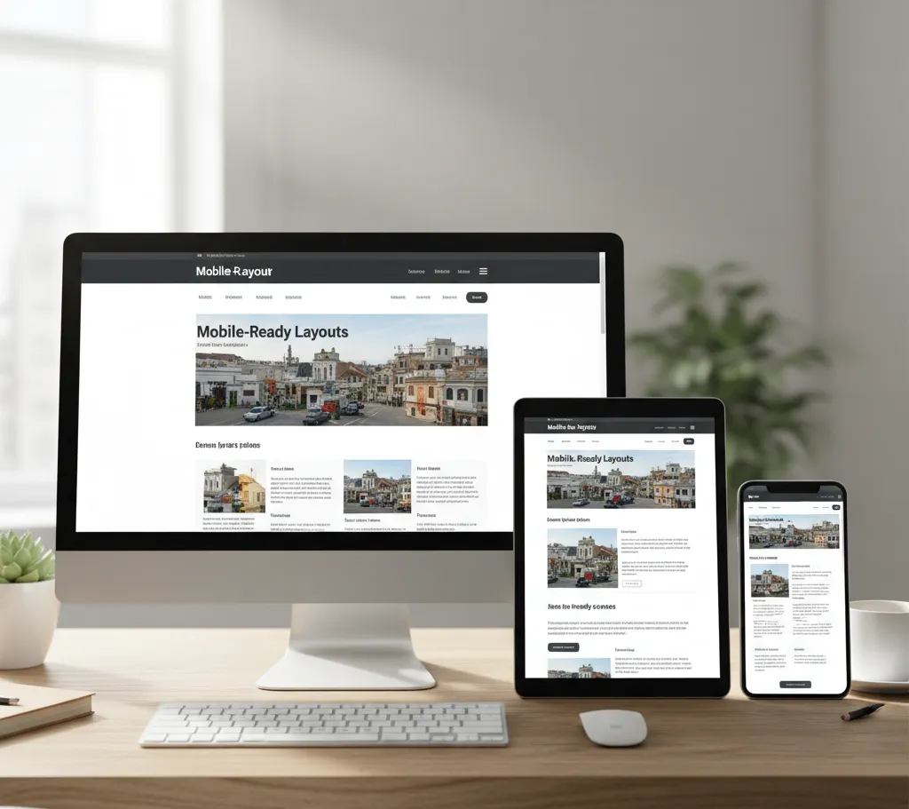
In today’s digital world, your audience may visit your website from any device. Responsive Web Design (RWD) ensures your site adapts perfectly to every screen, avoiding awkward layouts or zooming. At RafaelBPO, we create mobile-friendly websites that look great and perform flawlessly, keeping visitors engaged on desktops, tablets, or smartphones.
Your audience is always on the move, so we design layouts that adapt instantly to any screen. This ensures users enjoy a seamless experience every time, no matter what their device or location.
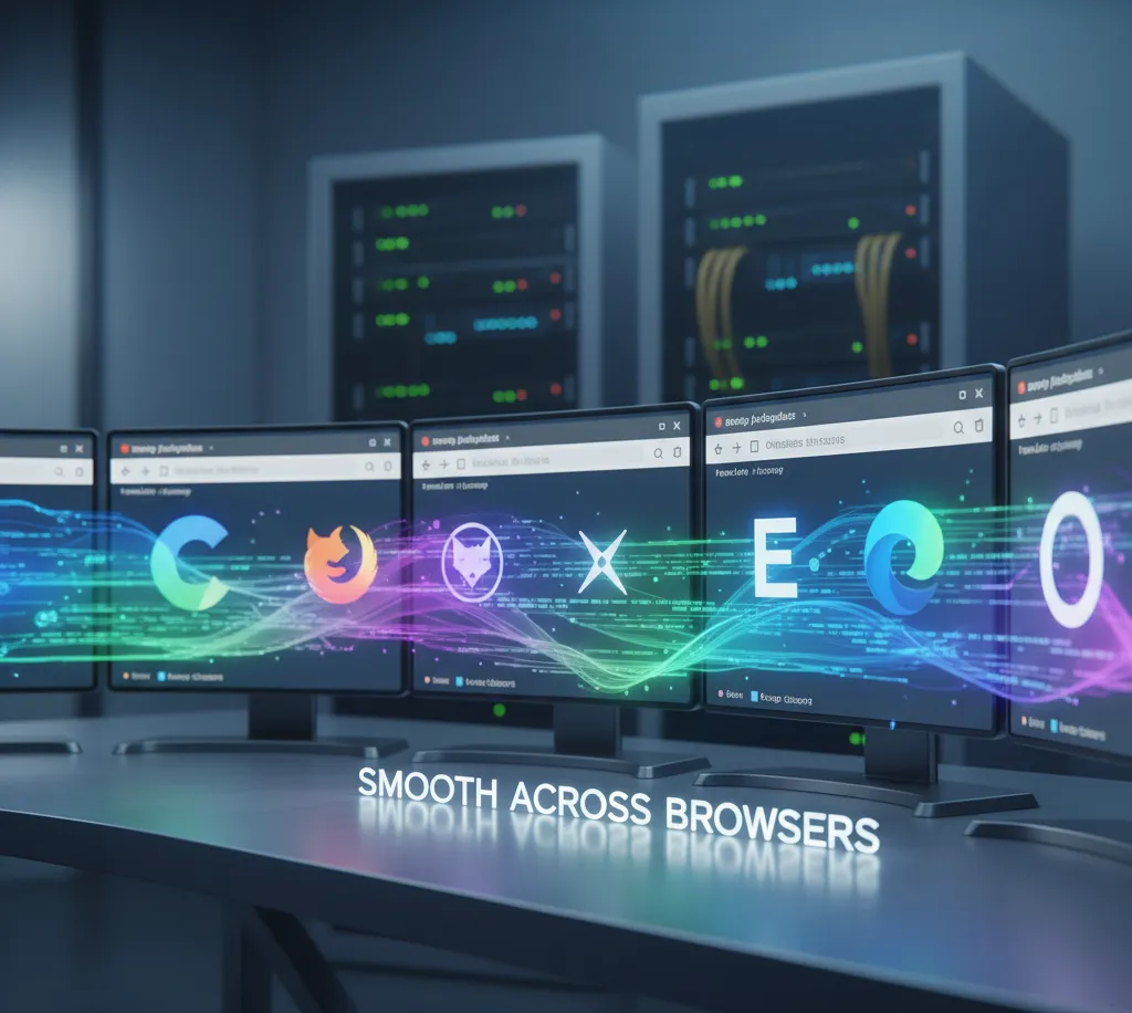
Smooth Across Browsers
No matter if your visitors use Chrome, Firefox, Safari, or Edge, we’ve got you covered. Your website will look flawless and perform smoothly on every browser, giving everyone a great experience without any worries.
Flexible Grids & Smart Images
No more one-size-fits-all websites! Your site adjusts perfectly to every screen, and with fast-loading images that stay crystal clear, visitors get an amazing experience every time. Plus, everything loads quickly so no one’s left waiting.
Touch-Friendly Navigation
Menus, buttons, and forms are easy to tap, swipe, and scroll, making mobile browsing intuitive and fun. Everything works smoothly so users can enjoy exploring your site without hassle.
Speed & Performance Boost
Slow websites lose visitors, so we optimize your code and images to ensure fast loading on every device. This keeps your visitors engaged and coming back for more.
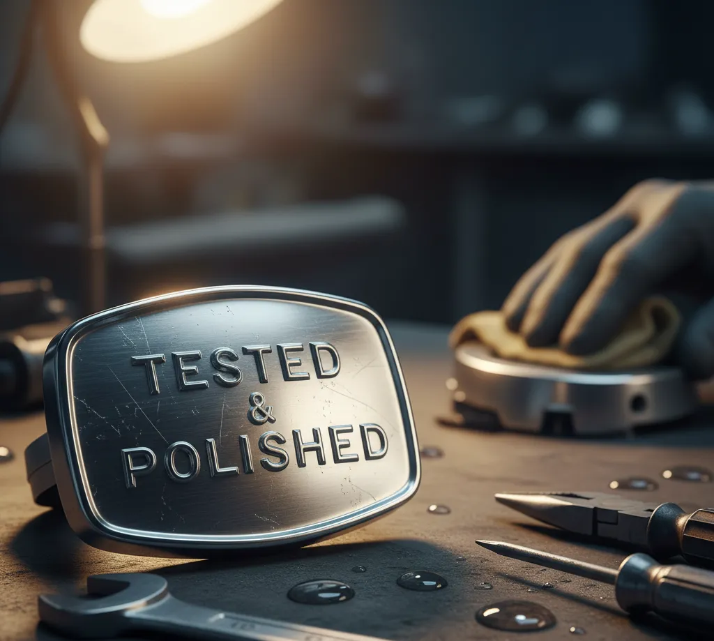
Tested & Polished
Before launch, your website undergoes thorough testing across multiple devices and screen sizes. This ensures a glitch-free, smooth, and hassle-free browsing experience for every visitor, every time.
Future-Proof Maintenance
Devices evolve, and your website should too. We provide regular updates and tweaks to keep it responsive, modern, and user-friendly, ensuring it runs smoothly and stays ahead as technology changes.
Why Choose Rafael BPO for Responsive Web Design?
Enhanced User Experience, Easy navigation keeps visitors engaged and coming back.
Faster Loading Times, Optimized layouts for instant access on any device.
SEO Benefits, Mobile-friendly sites rank higher in search engines.
Cost-Effective, One size fits all devices no need for separate versions.
Future-Proof, Stay compatible with new devices and screen sizes
Frequently Asked Questions (FAQs)
1
What is responsive web design?
Responsive Web Design ensures your website looks great and functions smoothly on any device, whether it’s a desktop, tablet, or smartphone.
2
Why is a responsive website important?
Most users browse on mobile devices. A responsive website improves user experience, reduces bounce rates, and helps your site rank higher on search engines.
3
Can you make my existing website responsive?
Yes! We can upgrade your current website so it adapts to all screen sizes without starting over from scratch.
4
Will responsive design make my website faster?
Absolutely. We optimize layouts, images, and code so your site loads quickly on any device, keeping visitors engaged.
Make Your Website Accessible to Everyone Now!
With RafaelBPO Responsive Web Design, your website becomes more than just visually appealing, it becomes functional, accessible, and user-friendly across all devices. Ensure your visitors have the best experience and watch your engagement grow.